Net Promoter Score Redesign
Average price from 2000+ person organization $5000-$20,000 within 9 months
In this project, I redesigned a graphic for customer loyalty for financial institutions as revealed by the Net Promoter scores of surveys conducted by banking institutions in US, UK, and Mexico. I found this data set here: https://www.kaggle.com/datasets/charlottetu/npsbank. I decided to study and transform real data sets for the net promoter scores (NPS) because they are simple but important. In fact, according to qualtrics.com, the net promoter score is the, “gold standard of customer experience metrics.” A score of zero means a financial institution’s customer is not at all likely to recommend financial services and a score of ten means a customer is actively promoting the services and products of the bank. I believe this is an important data visualization project because many persons have speculated that the United States may be facing a recession as part of the COVID-19 pandemic.
The original graphic was generated from the data set owner on kaggle.com and contained context errors, misleading scores, and inaccurate comparisons. I am interested in studying the scores for customer loyalty as rated by the NPS on a scale from 0 to 10. This dataset has 5000 customers taken from the United States, Mexico, and the United Kingdom using information from a survey given in 2021, however this graphic does not capture the 5000 rows of data. Moreover, we are also missing maximum threshold values in the graph a score of 10. The y- axis should be ranked on a scale from 0-10 however, Mexico’s score is reflecting a score of 17. Unless we assume that this information was taken from 2 different customer rows who both banked in the US, UK, and Mexico, the score of 17 is misaligned to the information presented and gives a misleading graphic for comparison. We are also missing context as to the customer surveys that lead to this result and the relative distribution of the data set. This graphic raises more questions than it answers.
2
Figure 1 – Net Promoter Score By Market Original Graphic on kaggle.com
Redesign Improvements
I wished to transform the bar chart and csv file of 5000 row values and 7 variables into an easy to understand box-plot and histogram graph using ggplot for an audience of banking managers or executives and their clientele. They could be interested in understanding which customers to focus their attention on and the effect of high scoring customers versus customers who give low scores. I found that the original graphs for this dataset failed to tell an accurate story especially when it comes to enabling accurate comparisons and providing context to support hypothesis generation. First, I wanted to understand the summary statistics for the information and I found that the median score was about 6.5, so I knew the distribution would be skewed left, which is good information to display on a histogram. I also wished to understand the distribution of the scores between the three markets, which is good information to display on a box plot. The summary statistics are displayed in appendix A.
1st Redesign – Histogram Diagram
The histogram diagram is an improved graphic because it shows the spread of the data and gives the full range of scores for the 5000 surveys. I used ggplot to generate the plot and found that my original assumption had been confirmed: the distribution was left skewed. However, this may be caused by one country or multiple. This histogram is an improvement from the first graphic because it gives the distribution of the entire data set not just one or two rows. I also labeled the axis to convey more meaning and understanding by showing the range of scores on the x-axis and the number of votes on the y-axis. I altered the title to clarify meaning may including ranking distribution in the US, Mexico, and the UK because many of these same financial services operate in all or a few of the countries sampled in this dataset.
The left skewed nature of the plot and dataset, stabilizes the perspective of the net promotor scores, on average scores are hight. This helps to give the audience, including banking managers and their clientele, an understanding that scores are generally high in this data set and we might want to flag any financial service NPS data points that are low.
3
Model Considerations
In order to improve the original graphic, I sorted the scores and grouped them by countries to begin to generate a line graph as a time series. However, this graphic may be misleading if the survey date is used as basis for comparison. I thought about understanding the variable importance features because there was a high chance that there would be confounding variables with survey dates and quarters influencing the NPS ratings. Variable importance is important in understanding the total amount of residual sum of squares. Below are my findings for the gini index node purity for a random forest model. The code is provided in appendix B.
I also used the information from the variable importance graphic to help to understand the data. One improvement I would make to my histogram would be to sort the information in a time series line graph. This would improve the view of each country grouped together based on the survey dates/quarters to help simplify appearance by putting similar cases close together.
4
2nd Redesigned Graphic – Boxplot
In my redesigned box plot, the median values and therefore the number of survey scores that fall in the third interquartile range for the net promotor score quantile are all the same. The biggest difference is in the 1st interquartile range between the US and both Mexico and the UK. The tails are much longer for Mexico and the UK which means there are more values that lie outside their interquartile ranges. These findings represent an improvement over the original graphic because it is an insight we could not gather from the bar chart. The long tail information coupled with the left skewed histogram may indicates that there is less loyalty and confidence in the scores given to Mexico and UK financial services. It may also indicate that the US is seen a safe or more secure less volatile place for financial services. These are assumptions and hypotheses that can be generated from the redesigned histogram and boxplot = graphics that could not be surmised from the original box chart graphic.
In my redesigned graphic, I incorporated the graphic design principles of distribution calculation in a box plot to help deal with the large dataset. I also engaged comparisons among small multiples in the random forest model and labels in grid lines for the box-plot. I modeled the data to reduce noise and complexity and decided to understand the market variable to manage information flow. In doing so, I was able to partition and split to simplify comparisons between the United States and Mexico and Canada and show threshold values and distribution.
5
Special Considerations and Effort
One special effort I included in this project was my attempt to add more variables to the random forest model to improve the percentage of variance explained by the model. It turns out that the data may not be a very good fit for modeling the net promoter score. It could also be the case that more variables or data may be needed. When I used the market variable alone only about 0.14 variance was explained by the model. I returned a negative -29.34% and a negative -8% variance explained when I utilized customer name and survey date alone in the random forest model. This indicates that knowing these factors can actually hurt the ability to interpret the net promoter score for a given financial service in the US, UK, and Mexico, all else being equal. I included this screenshot below.
I also began thinking about how to link the data using interaction terms so that in future analysis I can peek into higher dimensions and look at 3D models of more variables.
In the linear model, I thought about the variable importance plot least mean squared error and Gini coefficients and after a few iterations. I found that market and customer name as interaction terms in the linear model returned a high multiple R-squared and a p-value of 0.0953, which leads me to believe that interactions may have an important role to play in modeling score data relating to customer surveys. This linear model is displayed below.
6
My next steps would include either obtaining a better data set which explains more about the net promoter score (NPS) metric or try to find a proxy to the NPS that is more readily available. I would like to better understand the use of scores on marketing, general prices, price level and this assignment showed that models with low percent of variance explained by interaction terms that have lower p-values than we would predict, could benefit from robust linear regression modeling or perhaps some sort of sentiment analysis study.
References:
- Charlotteamy. (2022, March 2). Net promoter score (NPS) for Financial Services. Kaggle. Retrieved April 19, 2022, from https://www.kaggle.com/datasets/charlottetu/npsbank? datasetId=1968413&sortBy=dateRun&tab=collaboration
- Your guide to net promoter score (NPS) in 2022. Qualtrics. (2022, March 21). Retrieved April 24, 2022, from https://www.qualtrics.com/experience-management/customer/net- promoter-score/
Appendix A.
Summary Statistics CODE: library(ISLR)
library(leaps) library(lattice)
library(grid) library(hexbin) library(MASS) library(ggplot2) library(tibble) library(dplyr) library(gridExtra) library(randomForest)
read.csv(NPStimeseries) head(NPStimeseries)
ID Market `Survey date` `Customer Name` Month Quarter NPS <dbl> <chr> <chr> <chr> <dbl> <dbl> <dbl>
1 1000 US
2 1001 MEX
3 1002 UK
4 1003 UK
5 1004 UK
6 1005 US colnames(NPStimeseries)
[1] “ID” “Market” “NPS”
Krista Richards Monica King
Ricky Armstrong Andrea Foley Jerry Garcia Jimmy Rojas
9 3 11
10 9
0 10
01/09/2021 07/11/2021
4
25/12/2021 01/10/2021 01/03/2021 06/05/2021
12
10 4
3 1 5 2
4
“Survey date”
“Customer Name” “Month”
“Quarter”
8 10
7
dim((NPStimeseries))
[1] 5000 7
sum(is.na(NPStimeseries$NPS)) NPStimeseries = na.omit(NPStimeseries) dim(NPStimeseries)
> summary(NPStimeseries2) value
Min. : 0.000 1st Qu.: 5.000 Median : 8.000 Mean : 6.841 3rd Qu.:10.000 Max. :10.000
> summary(NPStimeseries)
ID Market Survey date Customer Name
Month Quarter
Min. : 1.000 Min. :1.000
NPS
Min. :1000 Length:5000
Min. : 0.000
1st Qu.:2250 Class :character
Qu.:2.000 1st Qu.: 5.000 Appendix B.
Histogram Code:
Length:5000 Length:5000
Class :character Class :character 1st Qu.: 4.000 1st
histPlot <- ggplot(NPStimeseries,aes(x=NPS, fill=NPS))+ geom_histogram(binwidth=3, fill=”blue”,color=”black”)+ labs(x=”Net Promoter Score (NPS) Ranges”,
y=”Combined Votes in Countries”,
title=”Financial NPS Ranking Distribution in US, Mexico, and UK “)+hw histPlot
Boxplot R CODE:
ggplot(data = NPStimeseries)+ geom_boxplot(mapping = aes(x=Market, y=NPS,))+ labs(x=”Financial Market Country”,
y= “Net Promotor Score “,
title= “Financial NPS Ranking Distribution in US Mexico and UK”)
Special Efforts- Random Forest
NPS5 <- NPStimeseries[,c(“Market”,”Customer Name”,”Quarter”,”Month”)] NPS5Rf <- randomForest(NPS~., data=NPS5,
+ importance=TRUE, proximity=TRUE )
NPS5Rf
Call:
randomForest(formula = NPS ~ ., data = NPS5, importance = TRUE,
Type of random forest: regression Number of trees: 500
proximity = TRUE)
8
No. of variables tried at each split: 1
Mean of squared residuals: 12.17494 % Var explained: 0.15
9
Marketing Campaign for Net Promotions and Return on Investment
Marketing Campaign using customer sentiment analysis
Product category
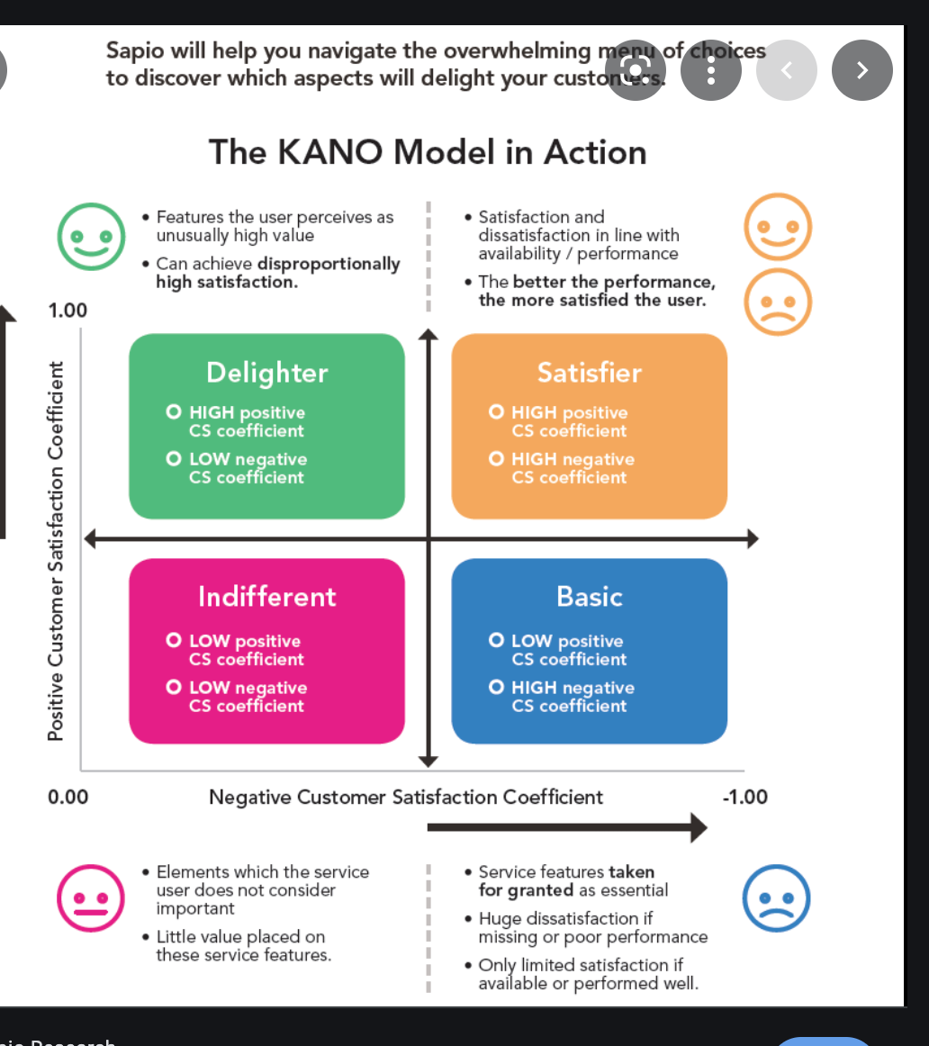
Capacity Planning – Manpower and Transportation
Product category
Product category
Product category

Campaign Product
$5,000.00-$20,000.00 Average Price Per Campaign
Navigating life’s intricate fabric, choices unfold paths to the extraordinary, demanding creativity, curiosity, and courage for a truly fulfilling journey. Poised to deliver excellent campaigns in a data-driven and professional manner. If you or your team are looking to drive marketing effectiveness today please contact me below.
- Emi Akiode, PMP
- #443-579-7936
- Virginia, USA
Reviews
“I love what you are doing. Keep up the good work.”

Estate Lawyer, 27 years of experience, Northern VA

